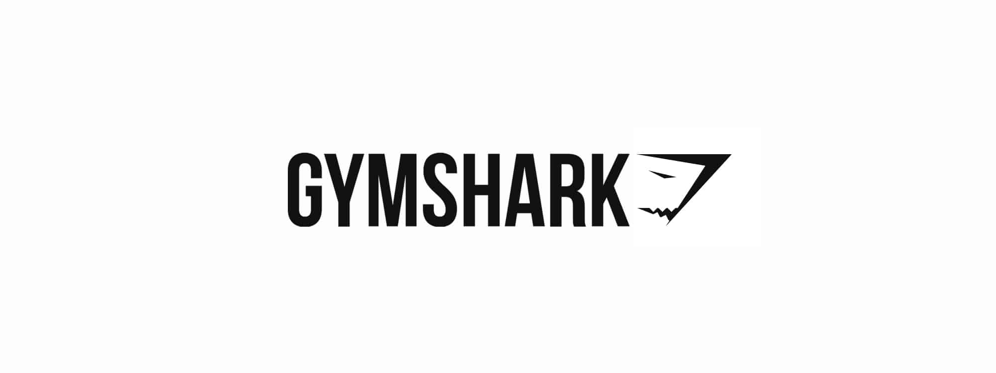
Gymshark Logo Design Case Study: The Making of an Icon
The Gymshark logo is a globally recognised symbol, and as its original designer, I’m often asked about its creation. This page provides a first-hand account of the strategic thinking and process that went into the Gymshark logo design. It’s the story of how an ambitious brief for a simple brand mark became a now-famous emblem.
When I was first approached, Gymshark was an ambitious start-up with a powerful vision. The brief was straightforward but challenging: to create a clean, iconic, and powerful motif that would be instantly recognisable and could grow with the company as it aimed to compete with legendary sports brands. This is an inside look at how that logo was conceived and designed.
The Initial Brief for the Gymshark Logo Design
I was approached directly by Ben Francis, the founder of an ambitious new fitness apparel start-up, Gymshark. He had already established the brand name and had a clear vision that the identity should be built around the powerful imagery of a shark.
The specific brief was to create a clean, simple, and iconic brand marque that could stand alongside the logotype. It needed to be instantly recognisable, convey strength and dynamism, and be versatile enough to work well on clothing and on digital platforms.
The Gymshark Logo Design: My Process & Rationale
My process for the Gymshark logo design began by going deeper than the initial brief. To deliver a truly effective design, it is vital to first ask the strategic questions that build a solid foundation (External link).
The answers from this discovery phase confirmed that my approach had to be grounded in the principles of modern, minimalist design, taking cues from legendary sports brands to create something truly iconic and lasting.
From there, the work moved from high-level concept to detailed execution.
Conceptual Goals for the Gymshark Logo Design
The brief for the Gymshark logo design called for a “simple motif,” and I knew that simplicity would be key to creating a powerful and memorable brand mark. Instead of a literal or overly detailed illustration, I focused on creating a strong, abstract shape that would carry the energy and dynamism of the brand. The core idea was to develop a symbol that felt active and forward-moving, reflecting the drive of the fitness community.
Rationale: Crafting the Iconic Emblem from Negative Space
The final Gymshark logo design is built on a clever visual principle. The overall logo form is a dynamic arrow, symbolizing progress, direction, and a relentless drive forward. Within this primary shape, the iconic shark’s head is revealed, crafted entirely from the principles of negative space. This is a technique used in some of the world’s most classic logos—such as the hidden arrow in the FedEx logo—to create a memorable, multi-layered design that is satisfying to discover. This approach allowed me to fulfil the brief for a clean yet powerful brand marque.
Designing the Gymshark Logo for Real-World Application
A logo designed for an apparel brand requires careful technical consideration to ensure it works well across many different production methods from embroidery and printing to online and app platforms.
From the beginning, the Gymshark logo was built as a robust vector graphic to provide the necessary flexibility.
The Outcome: A Globally Recognised Brand Mark
The final design successfully fulfilled the original brief for a clean, simple, and iconic brand marque that was technically robust and versatile for its intended applications.
Like it or loathe it, the ultimate measure of a logo’s success is not universal approval, but its effectiveness in meeting a strategic objective. This emblem did just that, and in the years since its creation, it has become a globally recognised symbol synonymous with the Gymshark brand and its dedicated fitness community.
Let's Discuss Your Ambitious Brand Vision
The journey of a single logo can help define a brand’s trajectory. Of course, a successful brand is more than just its logo, but a powerful brand identity often starts with that pivotal first mark. If you are an ambitious business owner ready to invest in a powerful, strategic, and memorable brand identity, I would be delighted to discuss how my experience and creative process can help you achieve your goals.
