Streetwear Logo Design: The ‘Fury Cry’ Expert Case Study

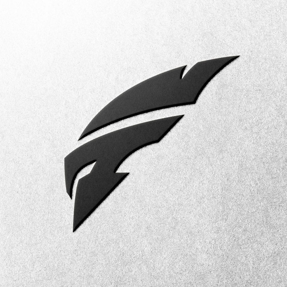
Streetwear logo for the Fury Cry brand, featuring a bold white Spartan helmet emblem that forms the letter F on a black background.

Streetwear Logo Design: Forging the 'Fury Cry' Emblem

Streetwear isn’t just clothing; it’s a powerful cultural statement. A truly impactful streetwear logo captures a brand’s raw attitude. It builds a dedicated tribe. Furthermore, it stands distinct from the endless stream of generic templates. This case study details the collaborative journey of creating the iconic emblem for Fury Cry, a brand that demanded an aggressive, edgy visual identity.

The Challenge: Crafting a Streetwear Logo with Unrivalled Edge

When the founders of Fury Cry approached me, they didn’t have a specific visual in mind. Instead, they had a profound feeling. Their brand needed to embody aggression, sharpness, and an undeniable presence. The core challenge was to translate this raw energy into a concrete, powerful visual identity.

This is the absolute cornerstone of any successful streetwear brand logo. My task was clear: design a streetwear logo that would resonate deeply with their target audience, screaming authenticity and defiance.
Close-up of the Fury Cry streetwear brand logo, showing embossed detail and texture.

The Design Rationale Behind This Streetwear Logo Masterpiece

A Symbol for an Edgy Clothing Brand

With an entirely open brief, the critical first step was to identify a symbol. This symbol needed to instantly communicate the ‘Fury Cry’ ethos. Drawing on my extensive experience in crafting potent brand marks, I knew we needed something that represented pure strength and a controlled, aggressive spirit. For this edgy logo design, the perfect concept emerged: the Spartan helmet.

It embodies resilience, discipline, and an unyielding forward momentum. These are all vital characteristics for a compelling streetwear logo.

Fusing Symbolism with Brand Identity

My vision was to seamlessly integrate the brand’s initial, ‘F’, into the formidable form of the helmet itself. This created a sharp, dynamic, and forward-moving aesthetic. It perfectly embodied the brand’s aggressive energy. This inherent energy is a core component of the brand. Indeed, it powerfully reflects the defiant, independent spirit that has always been at the heart of streetwear culture.

The concept was robust from the outset. After the initial design presentation, the project moved efficiently through the revision stage. It culminated in a refined streetwear logo in approximately three weeks. This swift, precise execution is a testament to the power of strategic thinking and collaborative partnership.
The edgy black Fury Cry streetwear logo de-embossed on a textured paper background.

The Outcome: An Edgy, Versatile Streetwear Logo Identity

The final design is a perfect fusion of form and feeling. It is an abstract ‘F’. It is also a stoic Spartan helmet. And it is a visceral embodiment of the Fury Cry name—all masterfully integrated into one clean, undeniably powerful brand mark. This apparel logo is instantly recognisable. Moreover, it provides the brand with a truly unique, ownable strategic asset. It’s not just a streetwear logo; it’s a declaration.

Does Your Streetwear Brand Demand a Real, Strategic Identity?

This project unequivocally demonstrates that a truly effective streetwear logo design emerges from strategic insight and deep collaboration, never from generic templates. This bespoke process is a core pillar of my approach, whether it’s for fitness branding, crafting a captivating streetwear logo, or developing any other authentic tribal identity.

Make an enquiry today and let’s craft a streetwear logo that transcends mere aesthetics to become a powerful, sales-driving asset for your brand.

Personal Trainer Logo Design | Professional Branding for PTs

Personal trainer logo design for coach Ryan Girvan.

Professional Personal Trainer Logo Design

A professional personal trainer logo design does more than identify your business—it builds trust, communicates your unique training philosophy, and attracts the right clients. In a competitive fitness industry, your brand is your promise. I specialise in creating impactful identities for personal trainers, online coaches, and instructors that form a powerful connection with clients from day one.

A Showcase in Personal Branding: The Ryan Girvan Logo

A perfect example of creating a clean, professional personal brand identity is the monogram I designed for Ryan Girvan, a Mind, Health & Body Coach.

The Challenge:

Ryan valued high-quality, professional services and needed his brand to reflect that. He favoured a clean, simple, fresh design, but the main challenge was to creatively combine his initials, ‘R’ and ‘G’—two very different letterforms—into a single, fluid, and cohesive symbol. The “R” also needed to be the more prominent letter in the design.

My Thoughts:

Working with a personal brand means capturing an individual’s ethos. The solution was a custom monogram that has a fantastic flow and fluidity to it. It took creative thinking, but I found a way to merge the two letters seamlessly while ensuring the ‘R’ remained dominant.

There is often so much to think about in a personal trainer logo design that you would never consider unless you do it for a living, and this project is a testament to that detailed process.

The full Ryan Girvan logo with RG monogram and wordmark.

Key Principles of an Effective Personal Trainer Logo

A successful personal trainer logo is a strategic tool designed to grow your business. My approach focuses on several core principles to ensure your logo is not just a graphic, but a hard-working asset.

  • Building Trust and Authority: Your logo must immediately convey professionalism and expertise. Just as a successful personal training career is built on a foundation of trust, often validated by a recognised certification, a brand’s visual identity must be built with the same level of professionalism.

  • Reflecting Your Niche: Do you focus on high-intensity training, holistic wellness, or sport-specific coaching? The best logos hint at this specialty. A gritty, strong logo for a powerlifting coach will look very different from the calm, organic mark for a yoga instructor.

  • Motivation and Aspiration: Your brand should embody the positive results your clients are working towards. The logo can communicate energy, balance, strength, or growth, creating an aspirational quality that motivates potential clients to take the first step.

My Design Process & Packages

My entire process is designed to be straightforward, transparent, and collaborative, ensuring the final design perfectly aligns with your vision and business goals.

  • The Process: I follow a clear, 5-step design process that keeps you involved at every key stage…

  • The Packages: My premium package is ideal for most fitness professionals…
A close-up of the RG monogram design on textured paper.

Fitness Based Logo Design Showcase

Here are a few other examples of logos I have designed for clients in the fitness and training sector.

Protein powder logo design featuring a Spartan emblem.

Project: TYTANOS
(Fitness Supplement Brand)

A powerful and aggressive brand identity created for a new whey protein brand, designed to stand out in the competitive UK fitness market.

Fitness club logo design for Gymheadz on a textured background.

Project: GYMHEADZ
(Fitness Logo)

A custom logotype design that provided a sophisticated, clean, and highly versatile text-based identity for a modern fitness apparel company.

Build a Brand That Gets Results

If you’re looking for an experienced logo designer to help you stand out and attract more clients, please get in touch. I would love to discuss your vision for your personal training business.

Peak Tennis Brand Logo Design

Peak Tennis Brand Logo Design Switzerland

Peak Tennis Brand Logo Design

Tennis Brand Logo Design Project

Hey, my name is Martin Williams designer of this tennis brand logo design project. I am a veteran logo designer with over 25 years professional experience. Below you will find an example of my work, more can be found in my portfolios, thank you.

The Challenge:

This was a tough but really enjoyable project. Peak Tennis hired me to rebrand their brand/company logo. The solution had to be simple and ideally incorporate the initials PTI.

The client wanted to stay away from using any traditional tennis iconography, such as tennis rackets and tennis balls etc. Therefore the brief was somewhat restrictive.

Tennis Brand Logo Design

My Thoughts:

I created a LOT of concepts for this project over several weeks. I looked at many solutions including abstract ways of using court markings and so forth.

I also experimented with many different ways of combining the PTI letters into a single cohesive emblem, of which this final solution was one such concept.

Overall, the first thing that jumps out at you with this emblem is the “P” letter shape (as it should being the primary initial) however, if you look closely you will see that the “P” shape is made up from a “T” shape and also an “I” shape.

Combining all those letter shapes into a dynamic sporty emblem was no easy task. But, this project just goes to show that, with perseverance, most things are possible.

The client was very happy with the final solution, and commissioned me to also create multiple versions of the logo for various sub-brands and to also create a set of brand guidelines for them.

Tennis Brand Logo Designer

Have a logo design project of your own?

If you are looking for a very experienced logo designer then please get in touch, I would love to discuss your project with you.

I have worked on hundreds of logo design projects over my long career so I am certain that I can be of assistance to you.

You can find further examples of my logo design work in my logo design portfolio, or read reviews from my previous clients here.

Have a question?

If you have a question about my logo design services you can find answers to the most frequently asked questions here

If you cannot find an answer there then please do not hesitate to contact me and I will be happy to answer your questions.

You can find more information on the types of logo design packages I offer here. However, I have designed most things over the years so don’t worry if what you require is not listed there.

Lawn Care Logo Design | A Small Business Case Study

A lawn care logo design for the DSM Lawn Care Ltd brand.

Lawn Care Logo Design: A Brand Refresh Case Study

This case study explores the brand refresh for DSM Lawn Care, a returning client for whom I had designed the original logo over a decade ago. The project involved creating a new, more modern and illustrative logo to reflect the business’s growth. It’s a perfect example of evolving a brand’s identity and showcases a different approach to lawn care logo design.

The Challenge: Evolving a Brand with Fresh Eyes

DSM Lawn Care decided it was time to freshen up their brand identity. The primary challenge of this project was approaching a brand I had created early in my career with a completely fresh perspective.

Knowing when and how to approach a brand refresh is a key strategic decision for any growing business (External link). The goal was to create a new logo that felt modern and detailed, while still retaining the professional trust the original design had established.

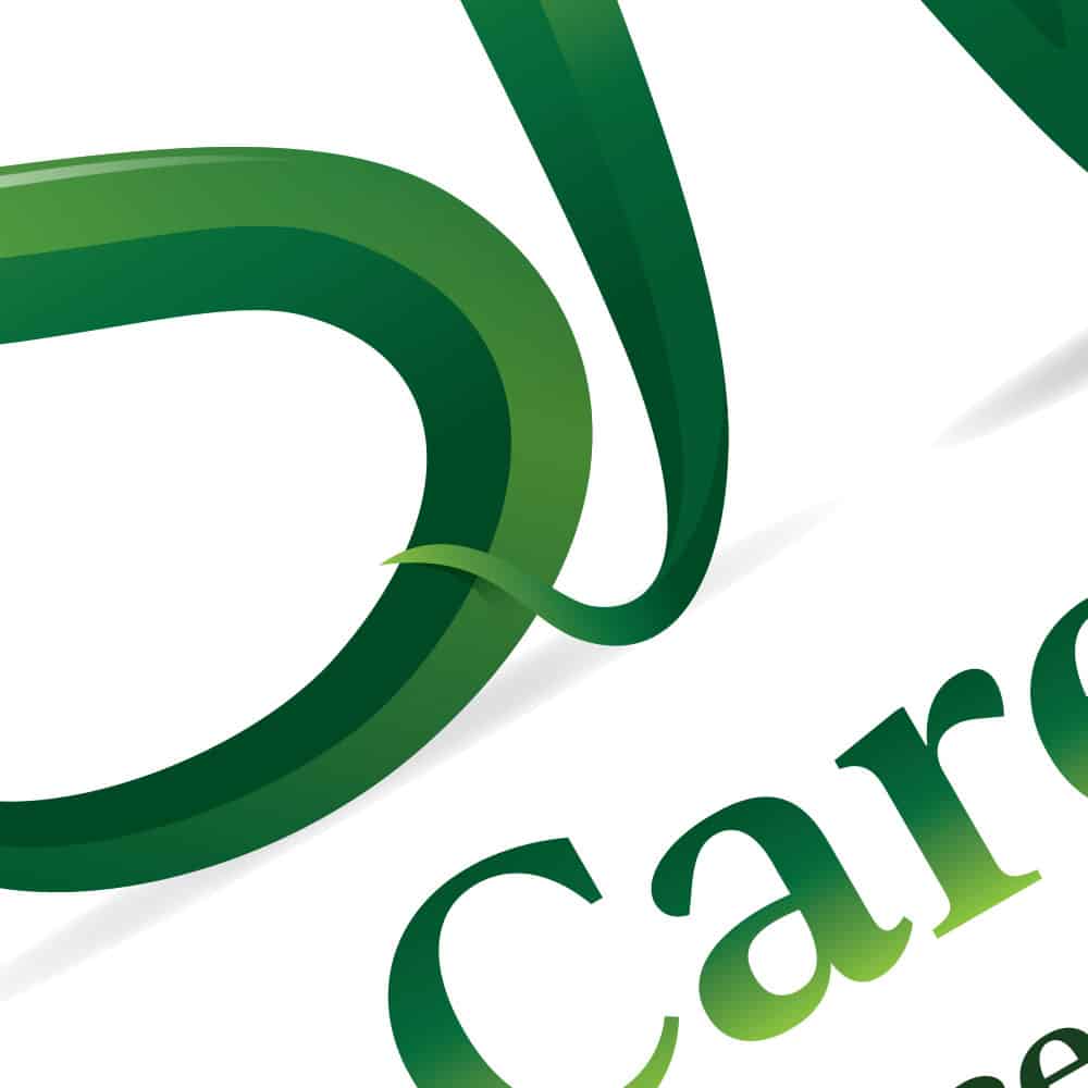
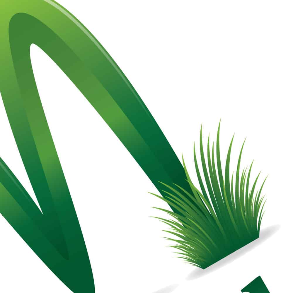
Illustrative detail of a lawn care logo design showing grass texture.

Design Rationale for this Lawn Care Logo

The client, David, was a pleasure to work with again and was very happy with the new, updated version of his brand. The final design focuses on illustrative detail to capture the organic nature of the business.

A Move to an Illustrative Style

For this brand refresh, we made a strategic decision to move away from a simple, clean mark towards a more graphical and colourful logo. This illustrative style allows the new lawn care logo design to tell a richer story, instantly communicating the nature of the business in a vibrant and eye-catching way.

Attention to Detail: Grass, Gradients & 3D Effects

The strength of this logo is in its subtle details. The letters ‘DSM’ are created from blades of grass, creating a direct visual link to the client’s work. To give the logo depth and a modern feel, I used subtle lighting effects and gradients to create a 3D effect, making the entire emblem feel more dynamic and professional. It’s this close attention to detail that can make a brand identity truly special.

Close-up of a 3D-effect lawn care logo.

The Outcome: A Fresh Identity for a Growing Business

The new logo provided DSM Lawn Care with a fresh, modern, and detailed identity that better reflects the quality of their service today. The illustrative approach makes the brand more memorable and distinctive in the competitive local market, giving them a strong foundation for the next chapter of their business.

Is It Time to Refresh Your Small Business Logo?

This DSM Lawn Care project shows how a brand refresh can modernise a business identity. If your small business needs a new look to better connect with customers, learn more about my dedicated logo design services for small businesses.

Simple Logo Design for Cotton Cobra

Simple Logo Design for Cotton Cobra

Simple Logo Design for Underwear Brand

Simple Logo Design for Cotton Cobra

Hey, my name is Martin Williams and I created this Simple Logo Design for Cotton Cobra. I am a veteran logo designer with over 25 years professional experience. Below you will find an example of my work, more can be found in my portfolios, thank you.

The Challenge:

Cotton Cobra were looking to get a simple logo design created for their men’s underwear brand. They had some clear ideas on what they would like, however, they wanted me to help them in creating the right image and polish to their initial concept.

The logo was to be used on material, on the waist band, packaging, labels as well as online and offline marketing.

They were keen to use a singular colour scheme either black or dark grey but they remained open to other options.

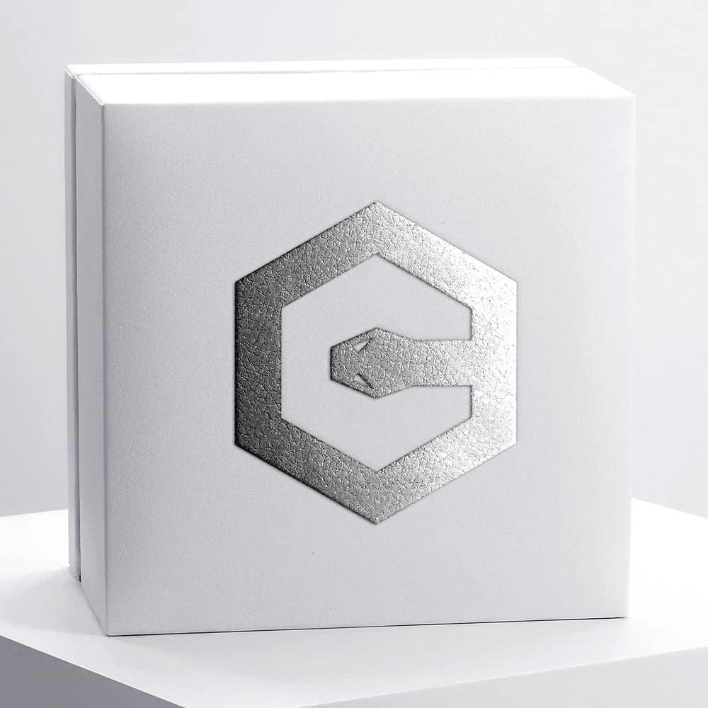
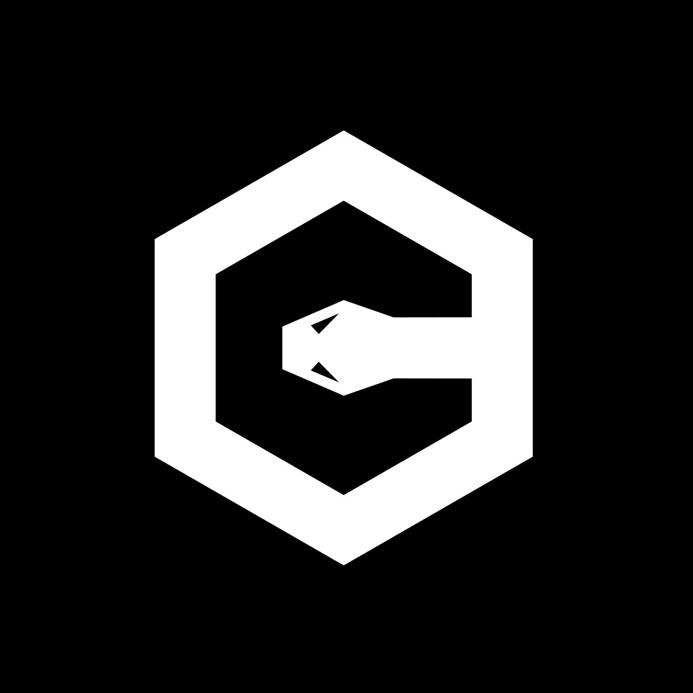
Cotton Cobra also requested the incorporation of a hexagon shape to show a geometric representation of snakeskin, as well as the use the brand initial “C”.

They wanted the logo to be contemporary, with few details and clean lines.

Simple Logo Design

My Thoughts:

So, this project came with a quite specific brief, with definite parameters within which I needed to work.

Besides what the company specified, if possible, I also wanted to try and work in a simple snake visual.

So, I started out with the basic hexagon shape and firstly experimented with how the “C” shape would fit into this. I soon realised that the best way to do this would be to use the negative space for the “C” element.

By using the negative space this allowed me to bring in the simple snake head element in order to complete the “C” shape.

Luckily this brands two initials were both “C” (Cotton Cobra) so there was no need to overcomplicate things by trying to work in a secondary letter.

The client was very pleased with the final design and I enjoyed working on a very different type of project with some quite specific requirements.

Simple Logo Design for Underwear Brand

Have a logo design project of your own?

If you are looking for a very experienced logo designer then please get in touch, I would love to discuss your project with you.

I have worked on hundreds of logo design projects over my long career so I am certain that I can be of assistance to you.

You can find further examples of my logo design work in my logo design portfolio, or read reviews from my previous clients here.

Have a question?

If you have a question about my logo design services you can find answers to the most frequently asked questions here

If you cannot find an answer there then please do not hesitate to contact me and I will be happy to answer your questions.

You can find more information on the types of logo design packages I offer here. However, I have designed most things over the years so don’t worry if what you require is not listed there.

Pump Clip Design | A Birmingham Brewery Case Study

A brewery logo created with a custom pump clip design in mind.

Pump Clip Design: A Birmingham Brewery Case Study

This case study details the brand identity created for Second City Brewery. It’s a perfect example of logo design for a Birmingham-based micro-pub where the specific requirements of pump clip design were a core consideration from the start.

The Challenge: An Authentic & Functional Birmingham Brand

The client, a new Birmingham-based brewery, needed a logo that was clean, modern, and authentic. The key challenge was to create a mark that was unmistakably “Birmingham”.

In a UK craft beer scene facing tough trading conditions (External link), a strong and strategic brand identity is essential for a new business to stand out.

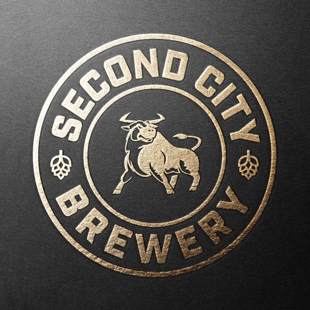
Example of a brewery logo and pump clip design.

Design Rationale for the Brewery Logo

The solution focused on combining a powerful local symbol with a practical, robust design format ideal for brewery applications.

A Nod to the "Second City"

To ground the brand firmly in its home city, the design incorporates a thoughtful, strategic reference to the iconic Birmingham Bull.

This instantly creates an authentic, local connection for customers. Rather than a complex illustration, the bull is rendered in a clean, strong style that aligns with the modern aesthetic of the craft beer market.

Designing for Pump Clips & the Brewery Environment

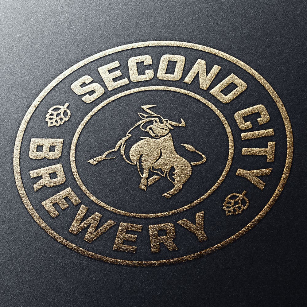
A successful brewery logo must work hard across many formats. The circular emblem format of this logo design was a deliberate choice.

It’s a classic, versatile shape that works perfectly for bottle caps, is easily adapted for tap handles and bespoke pump clip design, and creates a strong focal point on packaging and glassware. The bold, clear typography ensures the brand name is legible even on a busy bar.

Close-up on a Birmingham brewery logo showing its suitability for pump clips.

The Outcome: A Strong Local Brand Identity

The final Second City Brewery logo is a success because it is both thematically strong and functionally sound. The use of a local icon creates an authentic story, while the practical design ensures it works across all the brewery’s applications, helping the brand establish a presence in the Birmingham market.

Need a Logo That Connects with Your Community?

This case study shows how a locally-themed concept can create an authentic brand connection. If your Birmingham business needs a logo that speaks to your community, learn more about my expert logo design services in Birmingham.

Outdoor Brand Logo | A Watersports Case Study

n abstract outdoor brand logo for the Falling Coast company.

Outdoor Brand Logo: The Falling Coast Case Study

This case study details the creation of an outdoor brand logo for Falling Coast, a company in the competitive watersports market. The project is a perfect example of translating a unique product (modular paddleboards) into a symbolic and modern brand identity suitable for the outdoor lifestyle sector.

The Challenge: A Modern Outdoor Brand Logo

The brief for this project was to create an identity in keeping with leading outdoor activity brands. A core creative challenge was to design an emblem that consisted of three distinct components, reflecting the three parts of the company’s unique modular paddleboards.

The key was striking the careful balance between ruggedness and modern appeal—a common requirement in this design niche.

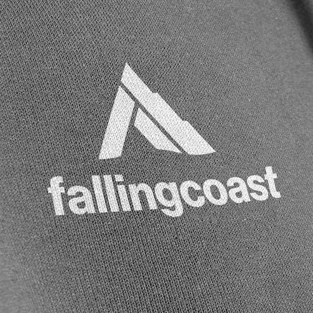
Example of a watersports logo printed on apparel.

Design Rationale: Creating a Symbolic Sports Logo

The design process for this outdoor brand logo involved exploring both literal and abstract concepts, with the client ultimately choosing a more evocative and intelligent solution.

An Abstract & Evocative Emblem

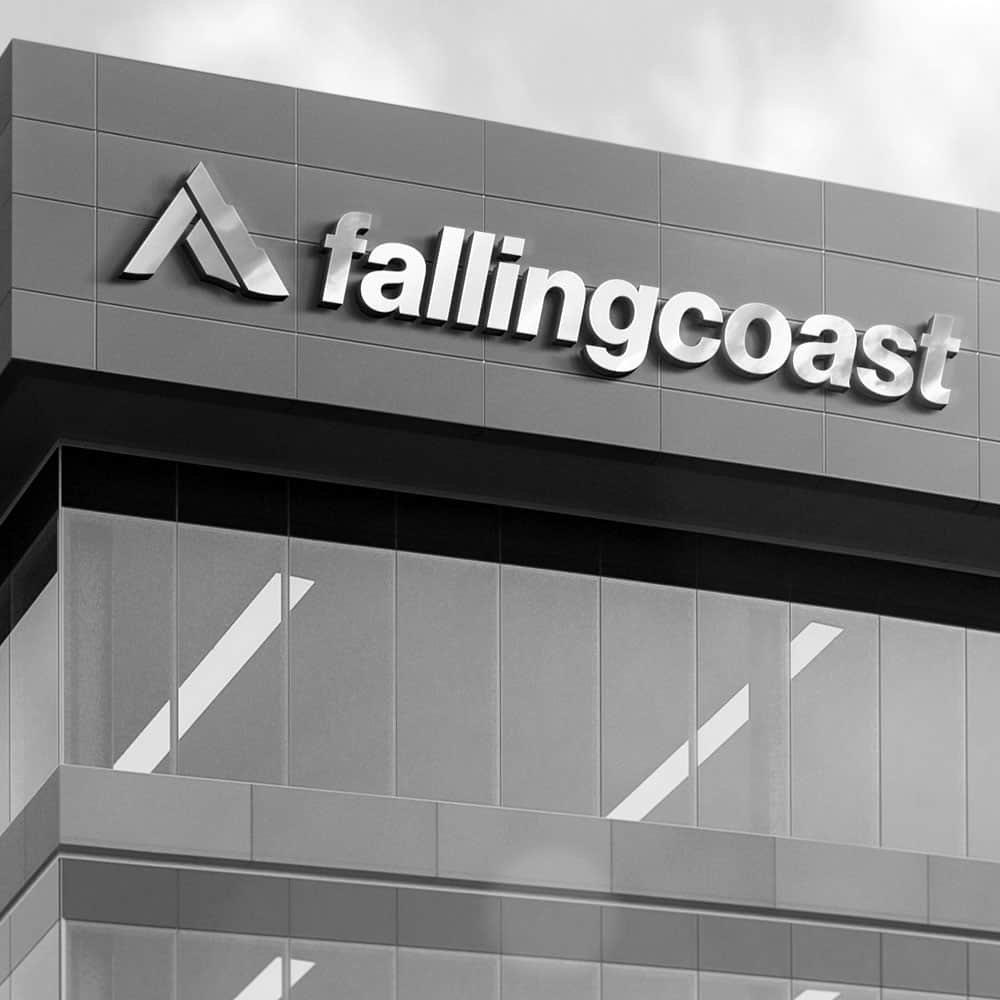
Instead of a literal drawing of a paddleboard, the final emblem is an abstract representation of a “falling coast” line or a cliff face. This mark is constructed from three distinct geometric shapes, directly and intelligently answering the main requirement of the client’s brief. This abstract approach gives the logo a more timeless and sophisticated feel.

Hidden Details & Deeper Meaning

The strength of this design lies in its hidden details. When the emblem is rotated anti-clockwise, it subtly forms the initial ‘F’ for the brand name. Furthermore, the inclusion of small wave lines at the base transforms the shapes into rocks jutting from the sea. These layers of meaning add a sense of discovery and intelligence to the brand mark, creating a more engaging experience for the viewer.

A modern logo for an adventure sports brand on a building.

The Outcome: A Unique Outdoor Brand Logo

The final Falling Coast logo design successfully fulfilled a challenging and specific brief. The result is a sophisticated, modern, and symbolically rich identity that gives the brand a unique and memorable mark to compete effectively in the outdoor sports market.

Alternative Concepts Explored

My comprehensive logo design packages include exploring multiple design routes to ensure the final direction is the strongest. For Falling Coast, this included several concepts, and I’ve picked out a couple of my favourites below:

These alternative designs are Copyright of Martin Williams at Pixel Freak Creative.

Creative concept for a symbolic watersports emblem.

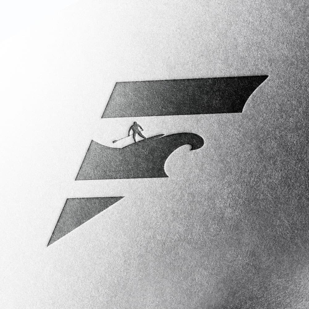
The first is a more illustrative concept that also cleverly forms the letter ‘F’. This three-segmented mark features the figure of a paddleboarder riding a wave, which forms the middle arm of the ‘F’.

It’s an amazingly fluid design and highly adaptable; the paddleboarder could be switched for a surfer, a swimmer, or even a leaping dolphin. This versatility means it can be easily tailored to a different brand, which is why this logo is now available for sale (and ready to be adapted as you require) here.

Abstract 'F' monogram design exploration.

These alternative designs are Copyright of Martin Williams at Pixel Freak Creative.

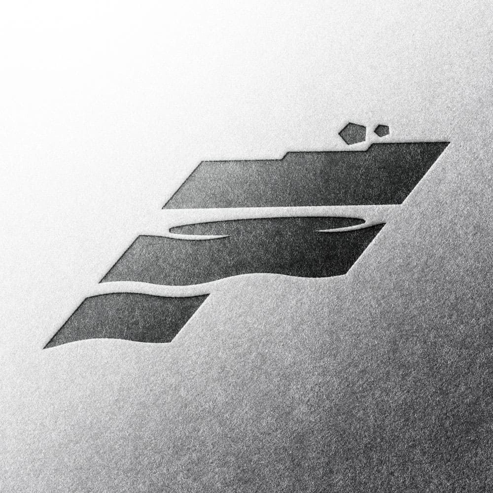
The second alternative shown here also forms an ‘F’ but is packed with different hidden elements.

The top arm of the letter represents the “falling coast,” with small rock details appearing to roll down its edge. The middle arm is shaped like a powerful wave with a paddleboard silhouette resting on top, and the bottom arm becomes a third, more subtle wave, completing the scene and the overall “F” letter-form.

Does Your Outdoor Brand Need a Unique Identity?

This Falling Coast project shows how a strategic approach can create a powerful brand story. If you need a logo that sets your brand apart in the competitive sports and outdoor market, explore my specialist sports logo design services.

Arena Salon Website Redesign Case Study | Stourbridge | Pixel Freak

Redesigned homepage for Arena Salon - Stourbridge website case study

Arena Salon: Stourbridge Website Redesign Case Study

This web design case study details the website redesign for Arena Salon, a prominent hairdressing salon located in Amblecote, Stourbridge. Tasked with transforming an aging online presence into one that truly reflected the salon’s modern, vibrant, and professional ethos, Pixel Freak undertook a complete overhaul. Discover the challenges, design process, and the revitalised digital platform created for this valued local client.

The Challenge: Arena Salon's Website Redesign Brief

Arena Salon, a well-regarded hairdressing establishment in Amblecote, Stourbridge, recognised the growing importance of a strong digital first impression. While their existing website was functional, it had become outdated over several years and no longer accurately represented the modern, vibrant, and highly professional atmosphere clients experienced in the salon itself.

This disconnect posed several challenges:

  • Brand Misalignment: A “tired and dated” website risked creating a jarring contrast with Arena’s contemporary salon environment and skilled services, potentially undermining their premium brand perception.
  • Attracting New Clientele: An uninspiring online presence could deter potential new clients actively searching for a high-quality salon experience in the Stourbridge area.
  • Showcasing Expertise: The old site may not have effectively showcased the full range of services, the talent of their stylists, or the quality of products used, limiting its ability to engage and convert visitors.

Annette, the owner of Arena, approached Pixel Freak with the clear objective: to commission a complete website redesign that would not only address these issues but also serve as a true digital flagship for the salon, accurately reflecting its quality and attracting its ideal clientele.


Arena Salon website: redesigned products page showcasing professional haircare
Interactive before-and-after feature demonstrating Arena Salon's website transformation

Designer's Insight: A Modern, Vibrant, and Professional Redesign.

The redesign of the Arena Salon website focused on creating a clean, modern, and engaging platform that truly represented their professional and vibrant brand.

  • Elevating Visuals with Professional Photography: High-quality imagery was key. I undertook new photography of the salon and also incorporated additional professional images sourced by Annette from her suppliers. This ensured the website visually communicated the quality and style of Arena Salon.
  • Clean Design and Intuitive Layout: A ‘less is more’ approach was adopted for the layout, resulting in a really clean design. The primary goal was to ensure that visitors could easily find the information they were looking for, with a clear and intuitive user journey.
  • Bringing the Site to Life with Technology: To enhance user engagement and showcase the salon’s transformations, modern web technologies were employed. This included interactive elements like ‘before and after’ picture sliders and subtle, eye-catching animations that added a dynamic feel to the site without overwhelming the user. The goal was to ensure these additions were not merely decorative but, as usability experts at Nielsen Norman Group emphasize, that any animation in UX serves a clear purpose and enhances understanding (external link).
  • Strategic Use of Colour: Colour was used minimally throughout the website design. This deliberate choice allowed the professional photography to take centre stage, with colour used strategically to highlight important calls-to-action and key information, ensuring a sophisticated and uncluttered aesthetic.

The client was really happy with the final result, and it was a genuinely fun and rewarding project to bring Arena Salon’s digital presence up to the high standards of their in-person experience.

Example of high-quality supplier photography integrated into Arena Salon website design
Arena Salon website design: new logo presentation and key service page layouts

Arena Salon Website Redesign: Outcomes & Client Feedback

The website redesign for Arena Salon successfully transformed their online platform into a modern, vibrant, and professional reflection of their high-quality salon experience. The new site not only showcases their services and expertise effectively but also provides an intuitive and engaging experience for their clientele.

Annette from Arena Salon was delighted with the outcome and the collaborative process:

“Excellent service received for our new website. Great communication and information throughout the process. Martin’s knowledge of what would work best is fantastic and made our website stand out, as well as saving money in the long run. The whole process ran smoothly, so I would highly recommend Martin – Pixel Freak to anyone thinking of updating their current website or developing a new one.”

ANNETTE, Arena Salon

This positive feedback underscores Pixel Freak’s commitment to delivering tailored web design solutions that meet client objectives and enhance their brand presence.

Visit the live Arena Salon website (link is external).

Ready for a Salon Website That Shines?

If the Arena Salon case study inspires you to transform your own salon’s online presence, or if you’re a Stourbridge business looking for an impactful website, I’d be happy to discuss your project. Let’s explore how Pixel Freak can create a website that truly reflects your brand.

Strong Logo Design That Builds Powerful Brands | The Pixel Freak

Strong logo design featuring a lion head G monogram.

Strong Logo Design: The Innergrit Case Study

This case study breaks down the process behind a strong logo design created for Innergrit, a brand built on the concept of inner toughness and resilience. It’s a perfect example of how strategic thinking and expert design can create a powerful emblem that communicates strength before a single word is read.

The Challenge: Defining a Strong Logo's Core Message

The client, Innergrit, needed a powerful emblem for their business. Their core request was to combine an animal motif with a letterform from their name—specifically the letter ‘G’.

The challenge was to select an animal that truly represented their brand’s ethos and to integrate it with the letter ‘G’ in a way that felt both natural and impactful, the very definition of a strong logo.

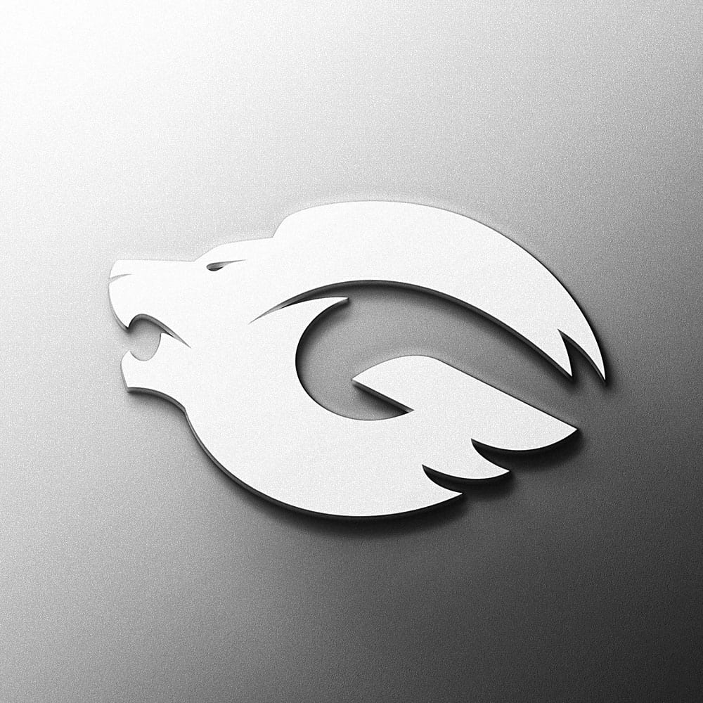
A white version of the strong lion logo design.

The Design Rationale Behind This Strong Logo

Choosing the Right Symbol: The Lion

After researching animals that symbolise strength and courage, I settled on the lion. The reasoning was twofold: firstly, the lion is universally regarded as a representation of courage and power, which perfectly mirrored the “Inner Grit” name. The selection of the lion was intentional; as a symbol of strength and courage, its use is well-established and has a rich history as one of the most enduring emblems in classic heraldry.

The Technical Execution: A Perfect 'G'

Secondly, I knew the ‘G’ letterform was structurally well-suited to combine with a lion’s head. When you look at a lion from the side, the flowing shape of the mane provides a perfect canvas to form the curves of the ‘G’. With this concept locked in, it was a matter of refining the design into a clean, modern, and powerful emblem with just the right level of detail to ensure a strong logo design that would last.

A strong logo design with a 3D metallic finish on a textured background.

The Outcome: A Clean and Strong Logo Design

The final result was a clean, memorable, and strong logo design that perfectly captured the client’s core brand value. The emblem works powerfully as a standalone icon while remaining intrinsically linked to the brand’s initial.

Do You Need a Strong Logo Design for Your Brand?

This case study is a perfect example of how a thoughtful, strategic process leads to a strong logo that tells a story. This is a core part of my approach to fitness branding, where projecting the right image is key to building a powerful connection with your audience.

Store It Away logo design

The final Store It Away logo design featuring the negative space key.

Store It Away: A Self-Storage Logo Design Case Study

This case study details the professional Store It Away logo design and rebranding project for the Stourbridge-based self-storage facility. The project goal was to move beyond a basic brand presence and develop a clean, modern, and memorable logo that communicated security and professionalism to its local customers.

The Challenge for the Store It Away Logo Design

Store It Away approached me for a full brand refresh. Their previous branding had not been a primary focus, and they recognized the need for a professional identity to build trust and stand out in the local market.

The brief was creatively open, with the core requirements being that the new identity must be clean, modern, and simple. The strategic challenge for this logo design was to visually communicate the core function of the business—security and storage—in a clever and non-literal way.

A clean colour vector version of the Store It Away logo.

The Design Rationale for the Store It Away Logo

I presented several solutions, but the winning design was chosen for its simplicity and the intelligent integration of a key symbolic element.

The "Key" Insight of the Store It Away Logo

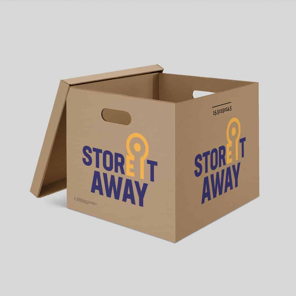
The centrepiece of this Store It Away logo design is the clever use of negative space. By carefully shaping the gap between the letters ‘E’ and ‘I’ in the word “IT”, a key shape is formed. This “hidden” key acts as a direct visual metaphor for security, access, and the service they provide, adding a layer of intelligence and discovery to the brand mark.

It’s a technique often found in professional logo design to create a more memorable and engaging identity.

A Professional and Secure Aesthetic

To support the concept, the typography is clean, strong, and modern, inspiring confidence. The colour scheme I devised is also on point for the industry, as understanding how branding builds customer trust (External link) is essential for any service-based business. Every element of the Store It Away logo design was crafted to build a sense of reliability and quality.

A mock-up showing the Store It Away logo printed on a cardboard storage box.

The Outcome: A Clever and Professional Identity

The final Store It Away logo design provided the client with a professional, memorable, and conceptually clever brand identity. The client was extremely pleased with the result, which elevated their brand image within the Stourbridge area and provided them with a versatile asset for signage, marketing, and their website.

Need a Professional Logo with a Clever Twist?

The Store It Away logo is a perfect example of how a thoughtful concept can elevate a brand. If your business requires a strategic and professional business logo design that builds credibility and sets you apart, let’s start a conversation.